Posted Wednesday, July 7, 2010
Last year, I redesigned the front page for surveys on Journey. Mostly, this was because survey takers had been having trouble finding the button to start the survey. Another reason was that I wanted to make sure survey takers with Journey accounts would be able to log in before taking the survey, so that if they felt like stopping halfway through, they'd be able to pick it up later on.
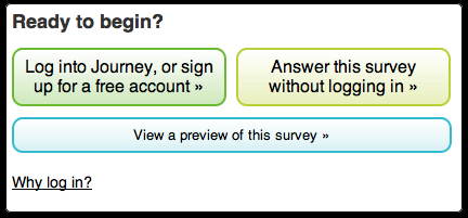
By and large, this new design was a success. I didn't hear any complaints about not being able to start the survey afterwards, and far more people started logging in. However, after the redesign, some users didn't realize that they didn't have to log in before taking the survey. Compounding this, some of them had difficulty signing up for an account.
To help with this, I've done a second redesign of the front page. I think this will make things a lot clearer. If you have any feedback, please do let me know. Thanks!
Here's a picture of the new design: